If I could give you a simple formula for what to wear for your family photo shoot, it would be this:
Muted colors + warm neutrals + varied texture + (optionally) 1-3 patterns
Muted colors– these can be lighter pastel colors or dark bold colors, just a little muddier than the bright colors like the ones that come in a crayon box.
Warm neutrals- creams, off-white, and tan/beige all work well
Varied texture– can be chunky knits, lace, embroidery, different fabrics, pleats, ruffles, detailed stitching, pockets, etc.
Patterns– this is a person preference thing. Some people like a cleaner look with solid colors, and some like to bring in more patterns. Plaid, florals, stripes, dots, or anything else is fine. Just don’t mix too much of the same type of pattern.
That’s pretty much it. So if you don’t want to have to read a lot, just go with that formula AND dress appropriately for the weather. But if you’d like more specific details, then let’s dive in. One important point before we get in to it: These are YOUR family photos, not mine, and they should reflect your family authentically. You should wear outfits that will make you love the photos for years to come, even if they don’t follow every “rule” in this guide. At very least though, please read the next two paragraphs before you scroll through to look at the pictures or you might be a little confused by the photos!
I thought it would be helpful to show you outfits that don’t work well in addition to great outfits so you could see the difference. Of course I’m not going to use anyone’s real family photos as an example of what not to wear, so I enlisted Chat GPT. I asked Chat to make me a photo of a family that would demonstrate what not to wear for family photos, and it gave me this:

I love how the fake mom and dad in this photo seem to be looking at me like “You did this to us. What were you thinking?! I hope you’re happy.” This was a little too far out there to be realistic, so I gave it another prompt with something more specific and a little more subtly wrong for family photos. It showed me the same fake family, dressed differently, and I decided to just go with it and have this make-believe family be the models for my “what to wear” article. So every photo in this post will be of our pretend chat gpt family kindly modeling the outfits that I requested. While the photos are indeed AI generated, the words are my own, based on many years of experience photographing families!
When I first started doing family photography over a decade ago, the advice we were giving families was to choose a color palette of maybe 3 colors, and have each family member display it differently. Here is our pretend family modeling that method with the navy, mustard, and white color scheme that was very popular around that time:
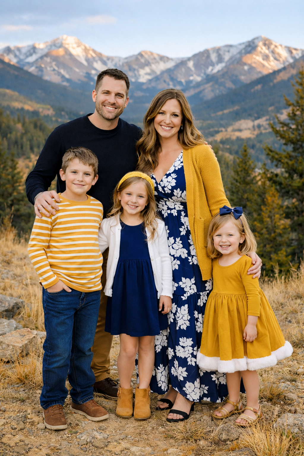
And it’s not bad. It’s cute, but it feels a little stiff and unnatural. I like to see a mix of colors that complement each other well without being too matchy. Let’s look at some photos of this family modeling the “muted colors + warm neutrals + textures + maybe a pattern or two” idea and talk about why it works:
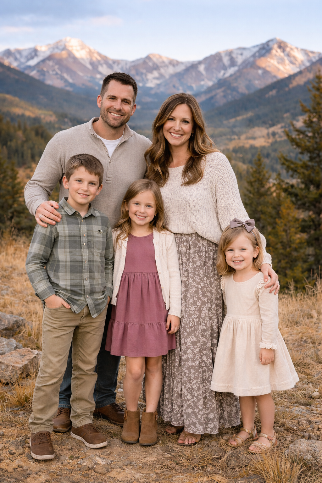
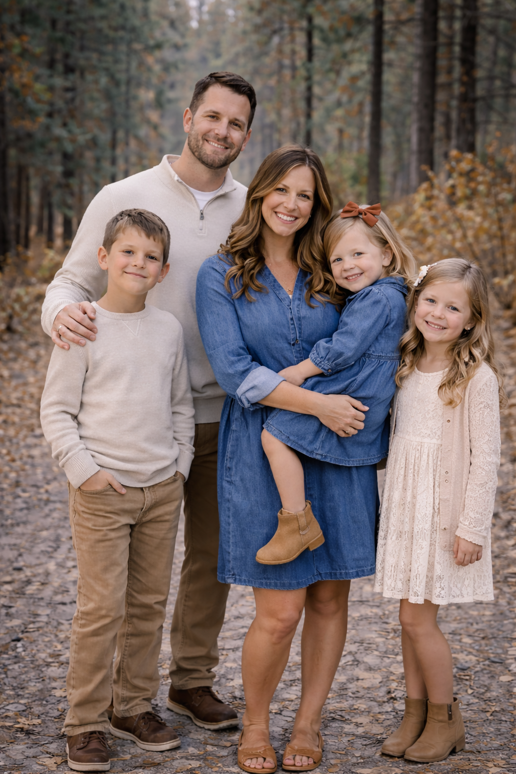
Here’s what I like about these outfits: The neutrals are warm (cream and tan) to complement the landscape, and we have a few muted colors mixed in. There are some patterns, but not too many, and we’ve got a few fun textures with mom’s sweater and the lace details on the little girl’s dress. Also, they paid attention to their shoe choices and all have shoes in neutral colors. Here’s another one:
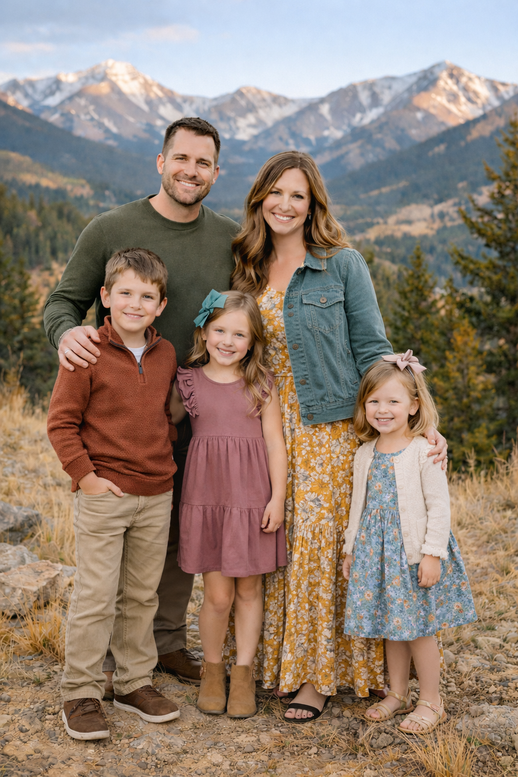
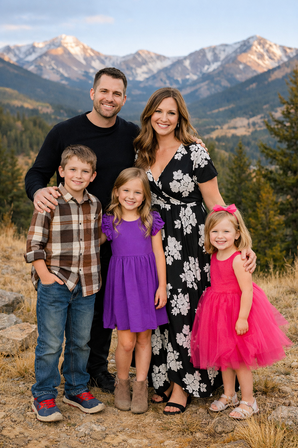
The middle daughter is wearing the same dress as in the last photo, but that’s okay. I guess even pretend moms have to work on a budget. This one has a little more color, but still with a few warm neutrals. I love all the colors in this one. It feels colorful without clashing with the muted colors in the landscape. A few colors are repeated in different ways, but there’s enough variety that it feels natural. We’ve got some texture with the lacy sleeves and mom’s denim jacket, and some layers and small patterns to add some visual interest. Now let’s look at an example with a fall backdrop.
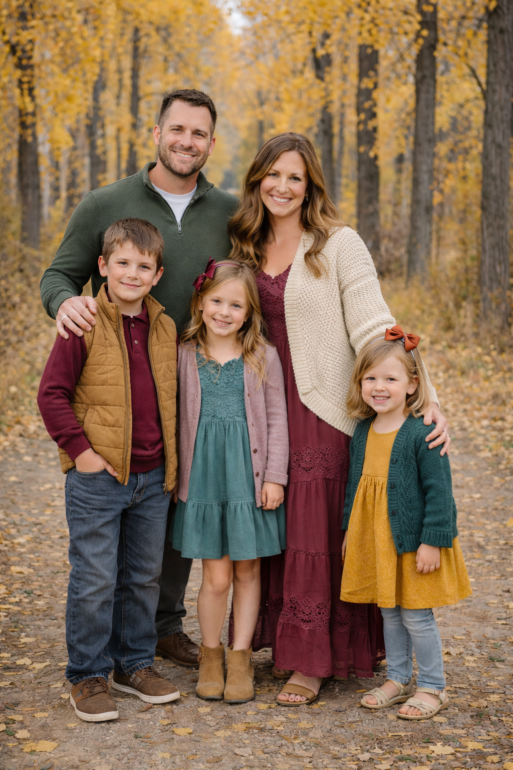
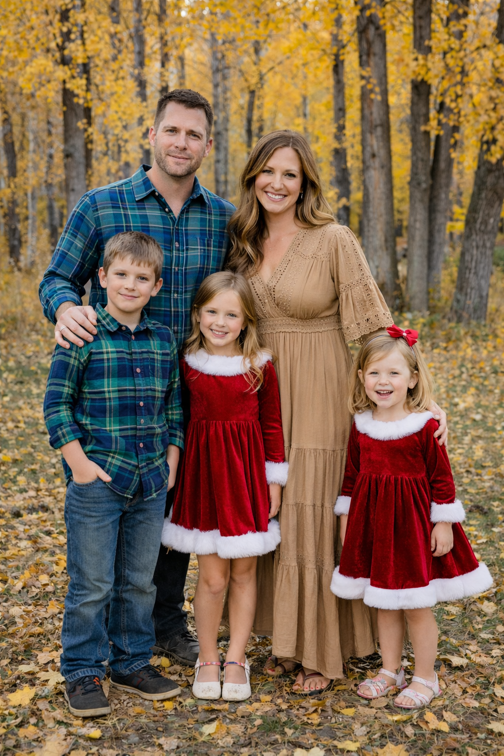
“Muted colors” don’t have to be pale/pastel. They can be bold and dark, but just a little muddier than the bright crayon box colors. All the kids have layers, which looks good, but also keeps them warm on a potentially chilly day. If these were real kids and it was actually a cold fall day, I would definitely recommend that the older sister wear tights or leggings with her dress and the younger sister wear socks and close toed shoes to keep her toes warm, but pretend kids probably don’t get cold, so these guys will be okay. I also love all of the textures in this one with the sweaters, lacy dress details, and puffer vest. There’s one more thing that I really like about the colors here. Mom and the son a wearing a darker burgundy color, and the older daughter’s sweater is kind of a more pastel version of that same color. The same thing is happening with little sister’s sweater and big sister’s dress, but in a muted jade green. I think that often works really well as long as there’s a big enough difference between the darkness of the darker tone and the lighter tone.
When considering who will wear what colors, make sure you think about who is likely to stick together in the photos. In the following example photo, they have a color scheme that I think often works really well- denim/blue with neutrals. The only problem is that the younger girl only wants to be held by mom, and she and mom are the ones wearing denim, so the photo looks unbalanced. If you have a kiddo who tends to cling to one parent, try not to dress them too similarly to that parent.
Here’s a beautiful real life example of that demin/blue and white color scheme: Horsetooth Reservoir Session Chat just couldn’t nail that one as well as this real family did!
Now we’re going to look at a few examples that kind of miss the mark:
Everybody looks great in this photo. I mean, they are an adorable pretend family and they’ll look good no matter what they wear. But do they look good with each other? Not really. Do they look good with the natural background? Not so much. There are several things that are going wrong here. First, mom and dad are wearing black and white. Generally, I’m not a big fan of a black and white color scheme for photos in nature. Black and white both don’t photograph well, with details getting lost in the highlights and shadows, and they just feel out of sync with the colors of the landscape. The same thing is true of the bright purple and pink that the girls are wearing. I do think there are some settings where these bright colors can look great, like in an urban setting (and this), a flower garden, or against a snowy backdrop, but they’re just a little harsh and clash with the tones of the Colorado landscape. Finally, when you take the 5 of them in all together, their outfit choices are kind of a mess, without any cohesiveness between the outfits. Make sure you consider how all the outfits look together, not just how each individual looks.
One more thing about this photo: Mom bought a nice flannel shirt for her son for this one, but you know what she forgot about until they were heading out the door? His shoes! He (like many real boys) only owns one pair of shoes that fit him, and they are worn out tennis shoes in bold colors. She’s wishing she would have run to Walmart to get him a cheap pair of shoes in a neutral color, but now it’s too late. This happens a lot. It’s easy to forget about the shoes. Here’s one more example that’s not quite there:
Now, I really hate to come after Mrs. Chat GPT for this one because those girls are so cute in their Christmas dresses. If this were a session in Old Town Fort Collins with the Christmas lights in December, I would absolutely want them to lean into the look of those dresses and put the rest of the family in Christmas colors too, but it doesn’t really work here. There are a couple other points that this photo brings up. First, plaid is great, but not too much. In most cases, I think only one person in the family should be wearing plaid because it gets to feeling pretty busy and distracting. One plaid shirt is great. Two is maybe okay, especially if one or both are layered with a vest or jacket. 5 plaid shirts is a lot.
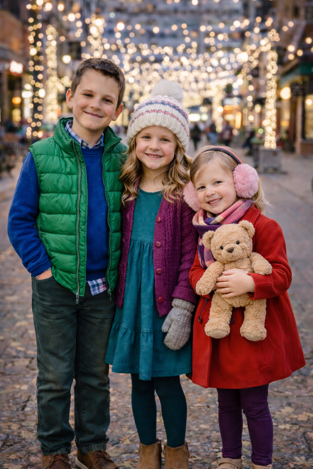
Second, be careful with matching. It definitely works and can be cute sometimes (especially for twins) but the photos are usually more visually appealing if everyone is wearing something different. If you want to have kids match, you could consider the same thing in different colors, or with a different accessory (like vest or sweater, or hat or scarf if it’s cold) added to it like this family did with the girls’ red coats and different accessories: Old Town Christmas Photos
We’re almost done, but I have one more photo that I want to use to talk about a couple other important points: cold weather and accessories.
Colorado weather can change so quickly, and kids have a really hard time smiling and being happy for photos when they’re freezing! Always be prepared for it to be colder than you think it will be, especially if your session is in the winter or late fall. The best solution is layers! You can put layers under their photo outfit, like with the shirt that the brother has under his sweater. If these were my kids and it was cold, they would be wearing two pairs of pants, leggings, or tights to help keep them warm. You can also put layers over their main outfit, like the vest and the sweater. If it’s winter, hats, scarves, and mittens make cute accessories that also keep you warm. I have some more cold weather tips in this blog post here.
We touched on accessories with the hats and scarves, which can be swapped out to add some variety to your photos. I also LOVE it when kids bring a favorite stuffed animal to their photo shoot. First, it can keep them happy and help them feel more safe and comfortable in a strange situation. Second, it is just so cute, and if it’s a constant companion to them in their current stage of life, it belongs in at least some of your family photos. If I haven’t convinced you yet, check out this session, and this one too.
I also wanted to point out that they are wearing bright “crayon box” colors in this photo, and it totally works! When we do photos in Old Town with the holiday lights, bright colors are great. If these kids were dressed in dark neutral colors, they would fade into the background, but I love the way the bright colors pop.
Lastly, if you have a session scheduled with me, feel free to send me a photo of the outfits you’ve chosen if you’d like a second opinion! But also, feel free to ignore my opinion and dress however you want. The best photos are the ones that are authentically you. As I said in the beginning, these are your photos and I want you to love them!